21 November 2009

Coming Full Circle:Rosie O'Donnell Residential Kitchen Design


This shows the main entry way into the kitchen.  As well as conveys the concept of a nest really well.  I wanted the upper cabinetry to envelop you throughout the entire space.  So as you walk into the space you have cabinets surrounding you from all sides.
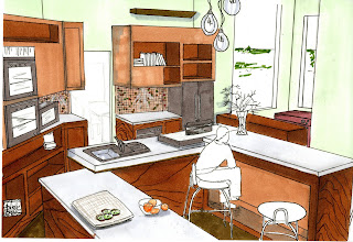
[ABOVE] This perspective has the double ovens on the left.  The center island is where the main activities of the kitchen take place.  The very first part of the island which is closest in this perspective is a lower level than all of the other islands, allowing for Rosie's 4 children to participate in cooking and being involved in the kitchen.  The middle section is where the cooking takes place [ stove top and sink]  Finally the furthest is an eating area.


Above is a close up perspective of my case piece, which is a storage and shelving unit I designed for the kitchen.

This perspective is another shelving area, i thought it showed off the backsplash of the wall really well.  Underneath the upper cabinets there is recessed lighting.  Which is also seen in the particular perspective

Two elevations:

20 November 2009

ROSIE Residential kitchen

Rosie Residential Kitchen Perspectives and elevations.


17 November 2009

Food Lab Redo

Redone foods lab renderings:   


Close up of the compost bin


16 November 2009

Foods Lab-Tennis

Below are the 4 perspective that I used on my board when presenting my Foods Lab design.  I think that all of the perspectives do a great job in allowing people to understand the space, however I will be adding a few more perspectives, and touching up my already existing perspectives for the final presentation of this project to the actual nutrition students and professor.

workstation: perspective showing the open cabinetry, easy access, and the "L"shape design of the workstations.
Showing student cubbies, and appliances that line the outer walls of the room creating fluidity throughout the space and working with the "L" shaped workstations.  I wanted students to have all the essentials in very close reach, yet still leaving plenty of room for them to not feel uncomfortable and as if they were on top of each other as they cooked.
This is a perspective of the teaching station, which is a raised platform to create hierarchy.  This perspective will be redone, for the final presentation in front of the nutrition students and the professor.  I did not take enough care to the ceilings, and the flooring...which is basically non existent since I did not render them, which I will be changing.

This perspective was used to allow the viewer to better understand the space, showing the ends of two of the workstation and giving  a frontal view of the teacher station.

15 November 2009

Foods Lab-Tennis

Concept: Tennis
In studio we just finished working on our second project of the three projects we will be doing all semester.  We had to re design the foods lab kitchen that the nutrition students utilize for learning.  The whole entire kitchen had to be sustainable and the professor gave us a list of all of the appliances and spatial needs she wanted.   The concept for the kitchen had to be a productive system, and I chose tennis.  I wanted to convey the rhythmic movement in tennis through my design, and focused on continuity, fluidity, and movement.  Two workstations which allowed for ten students at each station created an "L" shape in the middle of the space, allowing for easy access to all ingredients and appliance, and plenty of room for all students to be comfortable as they work, and for the teacher to be able to teach and demonstrate as well.


Below are a few perspectives that I drew of my finished space.


14 November 2009

Foods Lab Process

Here are some of the sketches from my Foods Lab journal that convey some of my thought process throughout the whole project.  The color scheme of the kitchen was a huge issue when I was figuring out the details of my design.  I knew what I wanted the kitchen to look like and how energized and exciting I wanted it to be, but  I wasn't sure exactly how I was going to go about conveying all of these ideas.  I didn't want the room to be too over powering and bright to the point of making the people inside of the space sick, and overwhelmed.  I finally came up with the color scheme of the middle cabinet example below.  


I knew that Anna specifically said she didn't really want cabinets, however for awhile I played around with the thought of still including them within the design, but later got ride of the whole idea, and moved more towards open shelves beneath the workstations.


05 November 2009

Final Entenza House Composition

As our last assignment for the the Entenza house unit, we had to create an 18x24 composition that included the following:  floor plan, 1 perspective, section and elevation section, which are all of the drawings we have been working on throughout the last few weeks.  


29 October 2009

Case Study Floor Plan

This is my rendered floor plan of the Entenza House Case Study #9.


28 October 2009

Case Study:Case Study Axonometric's

We have been working with the case study: Entenza House Case Study #9 for the past few weeks in visual communication.  This week we had to complete two axonometric views of the house, one was to be rendered in strictly pencil and was supposed to portray a grey scale.  The other rendered in markers and colored pencil.


I mostly used markers, and used colored pencils and cool gray's to convey shadows, which turned out to work really well.

22 October 2009

Section A of Case Study

This section was selected from the Case Study Plan, which I will be posting soon.  We had to render the section as a mid term for our drawing class, and we were supposed to convey how we have grown in our rendering skills.


17 September 2009

Color Study


For project 7, our assignment was to choose one of Maud Gaetweood paintings and utilize the paintings set of colors as inspiration for the perspectives we created in sketchup.  Then we had to trace our sketchup perspectives and render them in the colors from the painting we chose.  However each perspective had to be different.  One had to be a loose drawing, where you get
the general idea of the perspective, not worrying about accuracy, the other was supposed to be in between an accurate and a loose drawing and the last was supposed to be a perfectly rendered perspective.
Above is the Maud Gatewood painting that I used as my inspiration for the set of colors for my perspectives.  I picked this painting because I thought that it had a lot of variety and it expressed Maud's painting style very well.


This is my loose drawing, where I used very quick strokes to get the general idea of the furniture and shapes and textures.  I did this drawing on sketch paper, which has a very different reaction to the Prisma colors markers than the vellum that I used for the last two drawings.  The sketch paper absorbs the markers a lot more making the colors have a different tone to them as opposed to when using vellum.
In this drawing I focused a little more on my line weight and making sure that the lines were more accurate than the drawing above.  I took more time on the drawing.
This is my final drawing where I used a ruler my drafting board to make sure the lines were perfect and that everything was accurate.  I focused on line weight and worked on perfecting the furniture look not only in drawing and rendering them but also adding textures.

08 April 2009

Precedent Analysis Rough Draft

"The purpose of architecture is to shelter and enhance man's life on earth and to fulfill his belief in the nobility of his existence " eero saarinen.

Hand rendered with prisma's.  Images of the interior spaces of the terminal as well as exteriors.
The JFK memorial terminal, which is located in southeast New York City, New York, is one of the most well known/ recognized architectural structures worldwide. It was not always known as the JFK memorial. It was originally named the Idlewild airport, followed by the Major General Alexander E. Airport, the New York International Airport and finally in 1963 in remembrance of the late president John F. Kennedy they named the airport after him. The very first plane to leave this airport was in 1948 when construction was complete and the terminal was open to the public. The terminal immediately stood out from all other airports at the time because of its innovative design.
This structure is more than an airport because of what it symbolizes. Airports in general are a sign of unity in the literal sense, because they literally bring people together from all over. However this airport has a deeper symbolic meaning that just its obvious meaning. It is in remembrance of a president, and was named after him when he was assassinated. When the leader of a country is suddenly killed or died, followers feel lost, and this tribute stands as a reminder, that we are all united and stand strong. This airport is so much more than your average airport.
A specific moment stands out within this particular design is the TWA Flight Center or Terminal 5. Eero Saarinen, a Finnish American Architect, designed this terminal. This being his most famous piece of work; a blend of all of his previous designs combined as well as his expressionism and skill with concrete being shown. It was designed with the intentions of symbolizing an abstraction of flight. This is what viewers are drawn to when looking at the structure; it captures the eye and draws you in.
This airport was not just visually pleasing but it also contained features never before seen in airports at the time. When terminal 3 opened in 1962. It had a very distinguished and fresh new design. With its large, elliptical roof that suspended 32 seats of radial posts and cables; not only did the terminal cover the terminal but it continued on to the passenger loading area as well. With this particular detail this airport became the first airline terminal that had movable jet ways that connected to terminals.
This structures stands out as being a good example of a well-designed structure because of its importance, how relatable it is to everyone and how it can be appreciated by all. The design of the airports transforms it from its general use, and makes it more of a work of a art.


http://www.nylandmarks.org

http://wapedia.mobi/en/John_F._Kennedy_International_Airport

01 April 2009

Third Skin


 [Illumination]_ in studio this week we have been working on the 3rd skin project. With this project we had to think of a monumental moment in our lives, and find an object in nature that resembles our story and take the object from nature and use it as inspiration for our light source. The main thing with this project is to play with natural light. I designed my light source with a lot of natural shapes and layers of different sizes, which in turn creates a lot of shadows. This project was different from previous projects we’ve done in studio because of the fact that we had to design something that worked with lighting. As designers it’s important to understand how lighting can affect a space and how it truly works, and this project helped to give a small taste of that understanding. Every movement creates a new view, a new shadow, a new idea to explore.


Here are some photographs of my 3rd skin project.